
The Poor Are Doing Better Than You Think
Everyone says the bottom is being crushed in a K-shaped economy. The data say the opposite.

The notion that we’re living in a “K-shaped economy”— the rich powering strong spending with massive asset gains, everyone else ground down by rent, food, and insurance — is seemingly everywhere. Moody’s Analytics estimates that the top 10 percent of households now account for nearly half of all consumer spending — a record in data going back to 1989 — with their spending far outpacing everyone else’s since the pandemic. The Bank of America Institute, drawing on its own card and deposit data, reports spending growth that has widened by income through 2025. Beth Ann Bovino at U.S. Bank describes spending as increasingly dependent on wealthier households; Will Auchincloss at EY-Parthenon calls the divide not just income-based but age- and asset-based. On earnings calls, “the bifurcated consumer” has become 2026’s buzziest buzzword and media outlets reporting on the economy, from Yahoo Finance to CNBC, have run with the K-shaped meme.

While vivid and definitely memable, the K-shaped narrative us ultimately a claim about trajectories — about who is pulling ahead and who is falling behind over time — not about the familiar fact that the rich have more than the poor at any given moment.
And it turns out that separating fact from meme is difficult when you go beyond simple snapshots of inequality that tell you nothing about direction. The New York Fed finds a K-shaped pattern in wealth since 2023. The Atlanta Fed, using a payments survey, finds a “bifurcated recovery” in which both high- and low-income spending grew, just at different rates. The Minneapolis Fed, reviewing the available series, concludes the data are messier than the headlines suggest.
What explains why these sources are reaching different verdicts? Who’s right and why?
Each picks a starting point and faithfully reports an accurate answer — but it turns out the answer depends almost entirely on the starting point. The New York Fed anchors its window at the first quarter of 2023. Moody’s runs 2020 to 2025. The Atlanta Fed, 2021 to 2025. Figure 1 shows that if you choose an earlier starting point, one before Covid, it makes a world of difference.
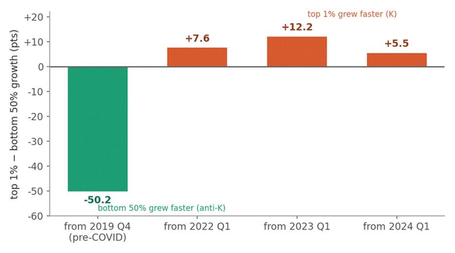
Figure 1 — “It depends when you start the clock.” Top-1%-minus-bottom-50% real net-worth growth, by the start date of the measurement window, all ending 2026 Q1. Start before the pandemic and the bottom 50% beat the top 1% by 50 points (anti-K). Restart anywhere after 2022 and the top pulls ahead (weak K). The sources I drew on to make these bar graphs are Federal Reserve, Distributional Financial Accounts (net‑worth levels); specifically, the Net Worth Held by the Top 1% — the DFA series (WFRBLT01026, via FRED) for the top arm of the gap; Net Worth Held by the Bottom 50% — the DFA series (WFRBLB50107, via FRED) for the bottom arm; and CPI‑U (BLS) — the price index used to convert nominal net worth to real before computing growth rates.
The pandemic transfers of 2020 and 2021 are the reason for this reversal, and, in the rest of this post, I argue that the so-called K-shaped economy is largely an artifact of where that episode falls relative to your start date — a pattern that gets clearer still once we look past wealth to income and consumption.
First and foremost, consider that a real, durable K-shaped trajectory should tend to push income, wealth, and spending in the same direction and keep them there. If that’s what folks mean by a K-shaped economy, then that is broadly what the data should show if they’re right.
Conversely, consider that a transient transfer episode — as happened during the pandemic, when the federal government flooded households with stimulus checks, expanded unemployment benefits, and an expanded child tax credit — should instead hit “the economy” in three different ways. It will show up loud and temporary in after-tax income, because transfers are income. It will also show up as a one-time step in wealth, because the transfers that get saved, and the assets they’re parked in, leave a lasting mark on a balance sheet. And it will show up barely at all in consumption, because the money was largely saved rather than spent.
To adjudicate between these competing views — the K-shaped structural break in the economy versus the one-off hump caused by a transient transfer — I look across income, wealth, and spending to see whether groups that were already ahead grew faster, in real terms, than groups that were behind. A strong K means the top rises while the bottom falls. A weak K means the top rises faster while the bottom still rises. Anything else — the bottom rising faster, or no clear gradient from bottom to top — counts against the claim. Moreover, when independent measures of “the economy” point the same way, that is strong evidence of something real and durable; when they point different ways, that is the signature of something transient and local. A real K should show up across wealth, income, and spending, and it should persist.
What about spending and inflation?
Don’t people usually mean something specific by “K-shaped economy” — and isn’t it spending, not net worth? They probably mean a split in spending: the affluent still dining out and traveling while everyone else trades down to discount stores — the “bifurcated consumer” that turns up on retail earnings calls. Bundled with it is a claim about inflation: that the bottom faces a steeper cost of living, with rent, groceries, and insurance swallowing whatever raises they get. I should be straight about how much of that bundle this post settles, because I don’t want it to read as a bait-and-switch.
While measuring real income that we that I do already nets out the average bite of inflation, what a common price index such as the one I use doesn’t capture is whether the bottom faced a higher inflation rate than the top, and the evidence elsewhere — the New York Fed among others — suggests it did, modestly, since late 2022. If the bottom’s true cost of living rose faster, then deflating its income by an average index overstates its real gains, making it easier to reject the hypothesis that we’re living in a K-shaped economy. Therefore, using the BLS's estimate that the lowest-income households' inflation runs about 0.4 percentage points a year above the highest-income households', I reran the analyses that follow by deflating the bottom’s income with that higher rate (and, as an upper bound, with a deliberately generous full point a year).
While that choice indeed makes the bottom look worse and a K-shaped economy easier to find, the contrarian finding continues to strongly hold: Over the full window the bottom 50 percent still vastly outgrows the top 1 percent in real net worth; the pre-pandemic "anti-K" gap of about fifty points would take some eight points of extra bottom-specific inflation per year — roughly twenty times the BLS estimate — to disappear. The income hump still round-trips to its 2019 level by 2022, and real spending still peaks in the middle of the distribution, not the top. Tilting the deflator toward the K sharpens only the modest, already-conceded post-2022 wealth divergence; it does not manufacture the strong, economy-wide K the headlines describe.
In what follows below, I report only the results obtained when using the average rate of inflation because it is the more reliable and transparent measure. The all-items CPI rests on a far larger price sample and a published, replicable methodology, whereas group-specific inflation rates have to be imputed from smaller samples and assumptions about each income group's spending basket — they are estimates built on top of estimates. The headline numbers should rest on the firmer measure; I use the group-specific rates only to stress-test the conclusion, which they leave standing.
On consumption, what I find again complicates the popular story that we’re living in a K-shaped economy. Real spending by income group, which I get to below, doesn’t sort into a clean K at all — and the available consumption measures themselves disagree, ranging from a steep K to no K-shape. The bottom line is that the bottom’s real expenditures didn’t collapse, and the fastest growth sits in the middle and uppermiddle of the income distribution, not the top.
This post is silent about the composition story: the idea that consumption has bifurcated into rich consumers splurging on luxury goods and European vacations while poorer consumers trade down, category by category, to afford the basics within a roughly flat budget. But “trading down” is a claim about how a given dollar gets spent; “the economy is K-shaped” is a claim about whose dollars are growing and whose are shrinking. The trading-down story only adds up to a K-shaped economy if those underlying trajectories are actually diverging — and that is exactly what turns out to be fragile.
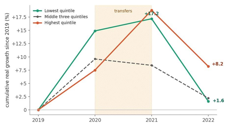
Figure 2 — The after-tax hump. Cumulative real growth in average income after transfers and taxes, by income group, 2019–2022 (2019 = 0). Source: CBO.
Income: the hump
Let's start with income, where the transfer story is clearest: the bottom quintile's after-tax income shot up in 2020–21, only to give almost all of it back by 2022. The poorest fifth of households' real income after transfers and taxes jumped about 17 percent above its 2019 level by 2021, then dropped to just +1.6 percent in 2022 as the pandemic's recovery rebates, expanded unemployment benefits, and one-year expanded child tax credit expired. In dollars, the bottom fifth went from about $44,000 in 2019, up to $52,000 in 2021, and back to $45,000 in 2022. The middle three quintiles traced the same arch, only shallower — up to about 10 percent at the peak and back to roughly 2 percent by 2022. The only group still clearly elevated in 2022 was the top fifth of the income distribution, at +8.2 percent — the receding tail of a 2021 capital-gains spike that hadn't yet fully normalized.
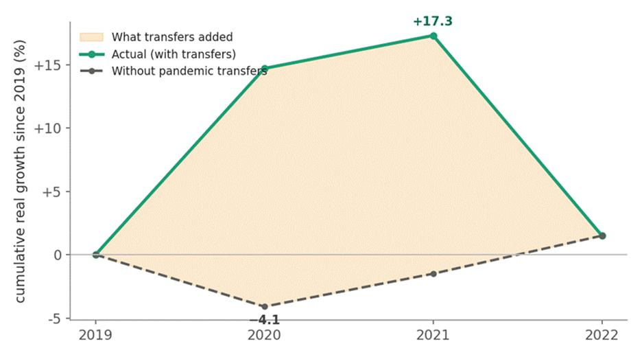
Figure 3 — What the transfers added. The lowest quintile’s after-tax income growth, actual versus CBO’s counterfactual that strips out the recovery rebates, expanded unemployment compensation, and expanded child tax credit. The shaded gap is the transfers. Source: CBO.
As Figure 3 suggests, if you strip the pandemic policies out, then the lowest income quintile doesn’t surge at all — it falls in the 2020 recession, to about −4 percent, exactly as you’d expect when a downturn hits the people with the least financial cushion, then climbs slowly back. By 2022, the two paths converge.
If we pan the camera further out, beginning the data series in 1979, the point is starker still. Figure 4 shows that, against four decades of slow, grinding gains for the bottom fifth, the 2020–21 spike is a single jag that snaps right back to trend.
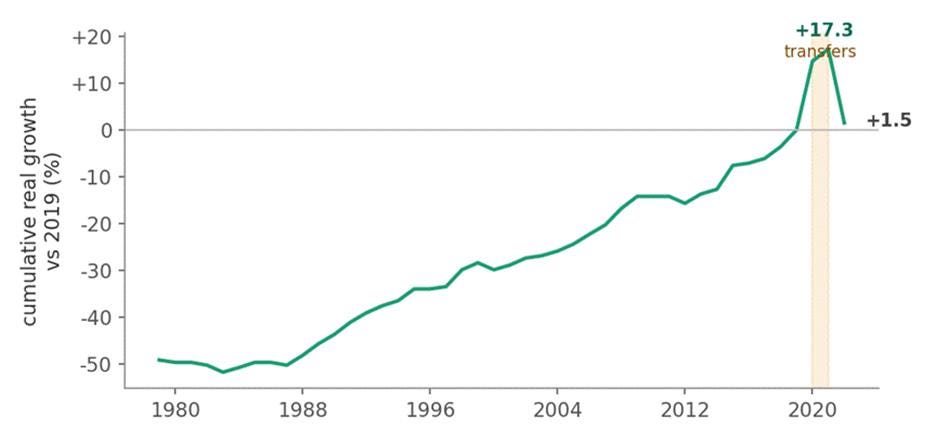
Figure 4 — Blip, not break. The lowest quintile’s after-tax income, 1979–2022 (2019 = 0). Decades of gradual climb, a sharp pandemic spike, and a snap back to trend by 2022. Source: CBO.
Survey data point the same way. In the Census Bureau's money-income series — the measure that most undercounts top incomes, and so most flatters the bottom's relative position — the lowest fifth's real income was essentially flat from 2019 to 2023, the top fifth's was flat too, and standard inequality measures barely moved. The most bottom-friendly lens available still doesn't show a widening K.
Wealth: the level shift
Wealth is where the anti-K case looks strongest — and where it’s easiest to overread. Over the full post-pandemic window, the bottom 50 percent’s real net worth rose about 80 percent, against just 30 percent for the top 1 percent. Taken at face value, that’s not a K at all; it’s the opposite. But the number is a trap, and three things show why.
First, it’s a step, not a trend. In nominal dollars, nearly three-quarters of the entire 2019–2025 gain — roughly $1.8 trillion of $2.4 trillion — was banked by the first quarter of 2022, and in real terms the bottom half has added almost nothing since. This isn’t a hump that reverts like income; it’s a one-time jump that sticks and then plateaus. The bottom half isn’t still gaining ground.
Second, the K story imagines two separate economies — the rich riding rising markets, the bottom sinking under housing costs. The balance sheets say otherwise: one asset-price rebound off the 2020 trough, lifting both, just scaled differently. The bottom half got richer the same way the top did — through financial-asset appreciation, the same lever the New York Fed finds doing the work at the top, where it's markets and not housing. Of the roughly $1.8 trillion banked by early 2022, financial assets account for the largest slice, about $0.78 trillion: deposits where saved stimulus landed, plus retirement and pension balances rising with the market. Home equity accounts for slightly less, about $0.77 trillion, and the rest is durable goods net of other debt. Alas, the bottom half wasn’t deleveraging through it all — mortgage debt rose by close to $0.8 trillion; home equity grew only because prices outran the new debt.
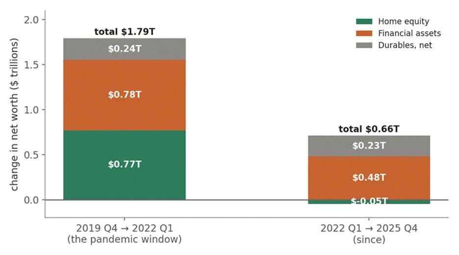
Figure 5 — What the bottom half’s wealth gain is actually made of. Change in the bottom 50%’s net worth (nominal dollars), split into home equity, financial assets (deposits, pensions, market balances), and durables net of other debt, for the pandemic window and since. Source: author’s calculations, Fed Distributional Financial Accounts.
Third, what gain there is sits on a depressed, leveraged base. The bottom half’s net worth in 2019 was still climbing out of the wreckage of 2008, and it carries a 60-to-69 percent loan-to-value ratio on its real estate — so small house-price moves swing its thin slice of equity around, and percentage gains off that small base look enormous. An 80 percent rise on almost nothing is still almost nothing; it doesn’t mean the bottom half has caught up to anyone.
Taken together, the wealth data cut against the K in both directions — the bottom half gained ground rather than losing it, but it isn't "winning" either; it banked a one-time windfall. The only thing here that looks K-shaped is the slow drift after 2022, and that shows up only if you start the clock in 2023, which is where the New York Fed starts theirs. Again, where you start the clock decides whether you see a K at all — and start in 2019 and there's no K to squint at: the bottom half outgrew the top, and the shape inverts.
Consumption: No K in sight!
When it comes to spending, the case for a K-shape collapses entirely. Real expenditures by income group from 2019 to 2024 barely move, and they don’t line up into a K at all. A clean K should climb step by step from bottom to top. This doesn’t: the lowest quintile is slightly down; the top is slightly up; but the fastest real growth is in the middle and upper-middle of the distribution, not at the top. Even the Atlanta Fed’s payments survey, which does find higher earners pulling ahead, has both income groups’ spending growing — a bifurcated recovery, not a collapse at the bottom.
The consumption story is the mirror image of the financial-asset build-up in wealth I just discussed: much of the transfer money went into deposits and debt repair, not spending. If a transfer windfall had been spent, you’d expect the bottom’s consumption to spike alongside its income in 2020–21. But surveys of how the 2020–21 checks were used found households spent only about 40 percent of them, saving the rest or paying down debt — so most of the windfall never reached the checkout line.
The Transfer Hypothesis is Vindicated, not the K-economy shibboleth
Put the three pieces of evidence together and consider the larger pattern that emerges — an idiosyncratic pandemic compression episode that’s fading. Income: a loud, temporary hump. Wealth: a one-time step that holds. Consumption: near silence. Whereas a real K economy should show up across all three outcomes and persist, this one shows up in one outcome, wealth, in one window, after 2022, in its weakest form.
This is also why, while pedigreed sources disagree, none of them is wrong per se. The New York Fed, anchored in 2023, sees the weak post-transfer K in wealth and spending. The Atlanta Fed sees a bifurcated recovery in spending where both groups grew. The Minneapolis Fed says the data are messier than the headlines. CBO documents the income hump and its reversal. Each of them saw one panel of a three-panel picture.
The only thing I’ve done is hold the three panels side by side and notice that, together, they rule out the structural-break reading — and that the confident phrase “the economy is K-shaped” quietly generalizes the single narrowest, most recent, most asset-specific result to the whole economy and the whole period.
The strongest case for the K-shaped economy
Since 2022, if we confine the analysis to wealth, the top of the distribution has grown somewhat faster than the bottom half. That’s a weak K — asset-driven, real, but modest, and it does not involve the bottom falling in real terms. Moreover, the “anti-K” signals that make the bottom look like it’s winning are the temporary 2020–21 compression, now fading. So, yes, after the pandemic transfers faded, you can squint and you’ll kind of see a K-shaped economy. But squinting is bad for your eyesight!
Why it matters
A few things follow. The first is a caution about reading the economy through a vivid letter. “K-shaped” can be confirmed or debunked at will by choosing a start date, which means it’s carrying more rhetorical weight than the data support at the level of generality people use it. And it cuts against both confident camps at once. Against “the economy is K-shaped and the bottom is being crushed”: it’s a weak, recent, asset-side pattern, and the bottom’s real income and net worth both sit above where they were in 2019. And against “the K is a myth, the bottom is actually winning”: that was the transfers, and they’re gone.
The second is about policy, where the clearest lesson is in the income hump. The years 2020–21 are a natural experiment showing that transfer policy can compress the after-tax distribution substantially, and in real time, and that the post-2022 “re-widening” is in large part the mechanical expiration of that deliberate compression — not an autonomous market force pulling the economy into a K. That reframes the question from “how do we stop the K” to something more honest: the tools that flattened the distribution demonstrably worked, and they were allowed to lapse by design.
The outstanding question is whether to make any of them permanent. That’s above my paygrade — or at least beyond the scope of this post.
Beyond that, since the only durable divergence between the rich and poor since 2019 is in the trajectory of their wealth appreciation and is essentially asset-driven, the policy lever that matches the diagnosis is twofold: housing supply, and the rent and interest-rate exposure of the bottom half’s leveraged, real-estate-heavy balance sheets — not broad income or consumption programs aimed at a K that mostly isn’t there in those domains.
None of this makes the affordability pressure that ordinary folks — meaning, the non-rich — feel imaginary. It says the pressure is better described domain by domain — with housing and asset access at the top of the list — than by a single letter that turns out to mean different things depending on when you start looking.
Sources and notes: Wealth figures are my own calculations from the Federal Reserve’s Distributional Financial Accounts, deflated by CPI-U. Spending figures are from the BLS Consumer Expenditure Survey. Income figures are from the Congressional Budget Office, “The Distribution of Household Income, 2022” (January 2026), Figures 3, 17, and 18, deflated by the PCE price index. The K-shaped commentary at the top draws on Moody’s Analytics, the Bank of America Institute, U.S. Bank, EY-Parthenon, and Navy Federal Credit Union; the skeptical and decompositional work draws on the New York Fed’s Liberty Street Economics — tracking and explaining the divide — the Federal Reserve Bank of Atlanta, and the Federal Reserve Bank of Minneapolis.